Over the last decade or so a common misconception has been repeated by digital marketing and CRO experts over and over again; that the average person now has the attention span of a goldfish. You’ve read that a hundred times or more, haven’t you?
If you actually think about the ‘statistic’ logically, you will quickly realise that it can’t be true. Most of us are quite happy to sit through a three-hour movie if it’s good. ‘People’ can binge their way through an entire Netflix series in one day. If the attention span of a modern human really was less than eight seconds, as is often claimed, Netflix would be as dead as Blockbuster, and the MCU would not be a thing.
There is one thing that is shrinking, however, at least in terms of online activities; our ability to focus for too long on any given task. It’s too easy to be doing something on one website – like thinking about making a purchase – and for a cellphone notification to go off alerting you to a new Facebook/WhatsApp/Slack message that needs your attention that then draws you away from the original ‘task’.
In terms of conversion rate optimization, a number of issues are hotly debated, and one of the largest right now are image carousels. Image carousels are those large banner images that sit at the top of a web-page and auto-rotate a series of different images.
A Real Image Problem
In theory, it seems like a great idea. Place a rotating series of images at the top of your site, each with a text call to action—what a great way to highlight various products, offers or different services. The conversion rates on these carousels must be good and a great sales driver.
That’s really not the case, though. Research conducted at Notre Dame found that, on average, just 1% of site visitors click on image carousels that do not move on their own (that have to be clicked) and those that rotate automatically don’t fare much better. They receive a little more attention – around 2% – but the first slide is the one paid most attention to, attracting 40% of all clicks. Conversion rates are very low too, according to the report failing to produce the results they expected (a purchase, a sign up etc.)
Why Are Image Carousels So Ineffective?
Why are image carousels so ineffective, when logic would seem to indicate otherwise? There are several reasons.
Banner Blindness
For years websites have begun to feature more and more banners and popups. Not just business sites, or retail sites, but even news sites. Users have to scroll past or close these banners to get to the actual content, and, as a result, many consumers have developed what has become known as banner blindness.
This extensive study from research firm Nielsen explains the phenomena in great detail, but to sum it up “Users have learned to ignore content that resembles ads, is close to ads, or appears in locations traditionally dedicated to ads.” And that includes image carousels.
Lack of Control
When a user visits any website, they want to feel as though they are in charge of their browsing experience while they are there. If faced with an image carousel, especially one that is moving automatically, it becomes disconcerting and frustrating.
This is especially true for an e-commerce site. Products and deals are sliding by, and if a browsing user happens to be interested in one, the chances are they won’t be able to click in time to get to the page they would need to land on to make a purchase, often leading them to click away confused.
Too Much Choice
It’s old marketing wisdom that if you are trying to get users to take a certain action, you should limit the number of options they have. This is because too many options leave users overwhelmed, resulting in them not taking any action at all.
Irrelevance
Most image carousels highlight between three and six products/services/messages. The odds are often not good that those that are highlighted are relevant to the user. The result is often that the browsing user looked right past the carousel and, in the best-case scenario, goes onto another area of the site but more often heads to another one completely.

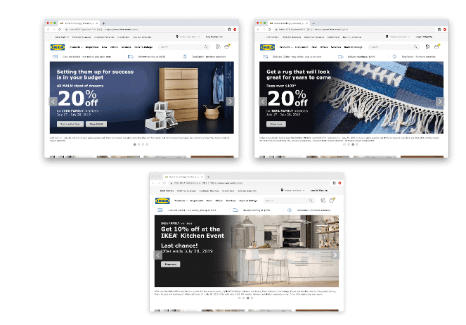
Here is one example. IKEA sells a lot of different products for use all over the home. But the three banners offered below are limited in scope. So if a user went to the site looking for a bed, they are likely to be confused by being pushed toward the kitchen or bathroom instead.
If Image Carousels Suck Why Are People Still Using Them?
So if they are ineffective, why do web designers keep using image carousels? There are lots of reasons. Often designers don’t think through the impact on users as we have just described, just that they like the images. People also often use a standard template for their site – especially WordPress and web builder sites – that is popular, so the carousel is used as a matter of course.
And the fact is that very few companies take the time to think through the customer experience deeply enough. They focus too much on the design and navigation they personally like and fail to give enough thought to what those preferences mean to the customer experience.
What To Use Instead
The web real estate taken up by an image carousel is usually some of the most valuable of all. So what should you put in its place? There are lots of options, including all the following:
Brand’s Main Value Proposition
Start things off with your brand’s main value proposition. This can be especially effective if you are operating in a niche that is specialized, and users may not immediately understand the value your business supplies.
Current Promotions

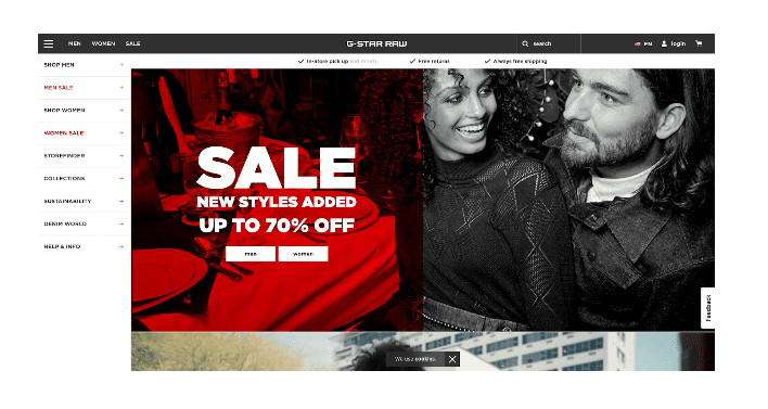
Instead of featuring multiple promotions highlight a current one, and make it the one that is likely to appeal to the majority of consumers. For example, if you are having a site-wide sale, make sure that is what your visitors are informed about first. This is a good example from denim clothing brand G-Star RAW. They offer clothing for both men and women, but it’s the sale that’s front and centre to draw everyone in.
Offer a Personalized Experience

Personalization is becoming more and more important. The more you can offer a personalized experience to users, the more you can offer them a great experience. For example, if a browser is a returning user offer them a hero image they haven’t seen before. If you can make that an image related to their last visit, even better.
Here is a great example from ASOS. They make use of cookies to detect what country a user is browsing from and also to ‘remember’ which category of clothing they browsed. When they return to the site, the hero image they see is from that category, making the experience far more personalized.
Do Image Carousels Ever Work?
In a few instances, when they are focused and well-thought-out, image carousels will convert well. Are you making use of one on your site right now? How well is it working out? Not sure? Contact Pearl Lemon Convert today, and we will help you find out.


