Mobile traffic is key. More than ever, people are searching online, looking for useful content and, when they think they’ve found it, reading it on their mobile devices.
Mobile makes more of an SEO difference than ever before too. Since 2018 Google has been quietly creating its mobile-first index. Maybe your site has already been included as a mobile-first site, many have (you will see a notification in Google Console if you have) But as of September 2020, every site in the Google index will be mobile-first.
This means a lot of things, but what does this mean for your content? Do you need to write differently when you’re addressing a ‘mobile’ audience? How do you tackle mobile copywriting? These issues and more are what we are going to take a closer look at here.
What Is Mobile First?
Before we get into how to write for a mobile-first index, we should take a minute to explain exactly what it is.
Google began its mobile-first initiative in 2018. It has been applying it to every new site its bots encounter since early 2019. Older sites it ‘monitored’ and included some ‘at random’ as a part of the rollout. Now, as we mentioned, as of September 2020 mobile-first will become the standard way Google bots crawl all websites.
The mobile-first index makes use of new bots. They call these smartphone agents. These bots crawl sites as if they were mobile devices and report their ‘experience’ back to be indexed. Desktop bots still exist, but their work will now be secondary.
In terms of SEO, the answer to thriving in a mobile-first world is not to create a separate mobile site. A technique popular in the 2000’s Google actively advises against them now. According to Google ‘the mobile presentation of your site mobile should contain the same content as your desktop presentation’.
This means making use of responsive design. Design that adapts according to the platform it’s being viewed from. This has been standard for a number of years now for new sites, but if your site has not been updated in years now may be the time.
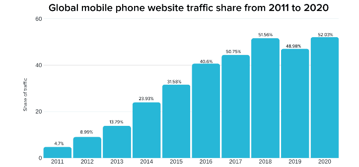
In switching to a mobile-first index, Google will be putting a mobile user’s view of the web first. This is because, as they predicted years ago, mobile devices are the most common way people consume content on the web. It now accounts for over half of all Internet traffic, as you can see in the chart below.

What this chart, which is based on data from statcounter.com, also shows is how rapidly mobile use has increased. It’s up over 20% since 2015 alone. This means that in addition to creating new copy that’s mobile-first friendly, you may need to address the old too.
Why You Need to Write Mobile-First Copy
Reading is different from reading on a desktop on a mobile device, mainly because the screen is much smaller. On a mobile device, texts appear stretched, because people have to scroll much more.
Besides that, people could be reading from anywhere on a mobile device. Most people use their ‘on the go’ mobile device while doing a myriad of other things as well. Which means their already limited attention span is often even more limited. They are not looking for fluff, they can read that later, at home, on their desktop computer. They are looking for useful, enlightening and/or entertaining information, and they want it now.
Not sure how to change up the way you write copy for a mobile-first audience (and search engine) Here are some tips.
Keep Focusing on Your Audience
The posts, articles and copy you write won’t be read by cell phones, but the audience holding them. So the first thing to keep in mind is that you should always focus your content on what your audience wants and expects of you. That won’t change if you start writing for mobile devices (too).
Focusing on the question: ‘how can I best write for mobile,’ is fine, but you should never lose track of the most significant issue: ‘what does my audience like?’ No matter what the content is, audience-first is even more important than mobile-first.
Watch Your Font Size
Font size is critical to content UX for mobile. You can’t just use all of your favourite desktop font sizes – and even fonts in general – without checking how they look on a mobile device.
It’s vital for people to be able to read your base font – your paragraph font – without pinching and zooming in. Make sure that there is enough white space between sentences, too. People usually browse their thumb when using their mobile to surf the web. This means that for the best experience, with that thumb, your visitors should be able to click on the items.
You should also be mindful of the fact that if you use more than three font sizes your site will look messy on mobile. The differences in size will be significantly more visible, and it will be jarring on the eye. People click away from those kinds of sites. That is why we advise that the number of font sizes used in a piece of content should be limited to two, perhaps three at a push.
Write Shorter Sentences.
On the typical desktop or laptop screen, a 25-word sentence takes up two lines. It will be four lines for a smartphone, tablet or similar device. Longer sentences will stretch over even more of the screen’s readable area, making it even more difficult for readers to recall words in their short-term memory.
So while users might read (skim) what you wrote, but they are less likely to remember it. This is actually a good rule in general. Get used to writing shorter sentences. When you do, you’ll increase reader retention in general, but especially for those consuming your content on the go.
The challenge is to write shorter sentences without creating a poor copy. For those who outsource their content, this means paying closer attention to quality control. For those who have an in-house writer, it may mean a change to the in-house style guide.
Write Shorter Paragraphs
Moving on from the last point, your paragraphs should be shorter too. Being faced with the walls of text created by long paragraphs on mobile is off-putting. Ideally, paragraphs should be no more than five sentences long.
Make Sure There’s Enough Whitespace
This point goes to general web design as well as copy. Whitespace is a great way to break up those long blocks of text, and its proper use makes consuming content on the go easier and more enjoyable. Content that is easier and more enjoyable to read will be retained by the reader longer, and they are more likely to follow any calls to action.
Watch Your Text Structure
Your text construction will have to be perfect. Paragraphs need to follow one another in a logical order in a well-structured text. Sentences also need to logically link with one another within paragraphs. So make sure you make good use of transition words. Those words will help people understand your text’s meaning.
If your text is well organized, the key message of your content will be easier for people to understand. If your audience can’t understand this message, they’ll get lost and tune it out.
Revise Old Copy
We mentioned this earlier, but now let’s look at why you should revise old posts, articles and other content too.
Google is not planning to re-index the whole web in its move to mobile-first. But your older content will remain in its archives, and if it is not mobile-friendly, that may hurt your SEO. Therefore, get into the habit of reviewing old content to see if it needs to be updated to reflect the new mobile-first best practices.
There is an added bonus to undertaking this possibly arduous task. Updating your content will alert the Google Bots to head back to index it. When they do, finding that it is now mobile-first friendly will almost certainly help your SEO efforts.
Final Word
Mobile-first copywriting isn’t that different from writing for desktop. You have to write for an actual audience in both cases. ‘Mobile’ texts need to focus on readability more than ‘desktop’ texts. That’s because reading is more challenging from a mobile screen than reading from a desktop.
Nevertheless, if you make sure your readability is top-notch, there will be plenty of readers of your content on both handheld devices and desktops. Need content advice? Contact us. Our SEO experts will review your content and help you revise it for a mobile-first index and help you create a new content plan that ensures your content stays that way in the future.


